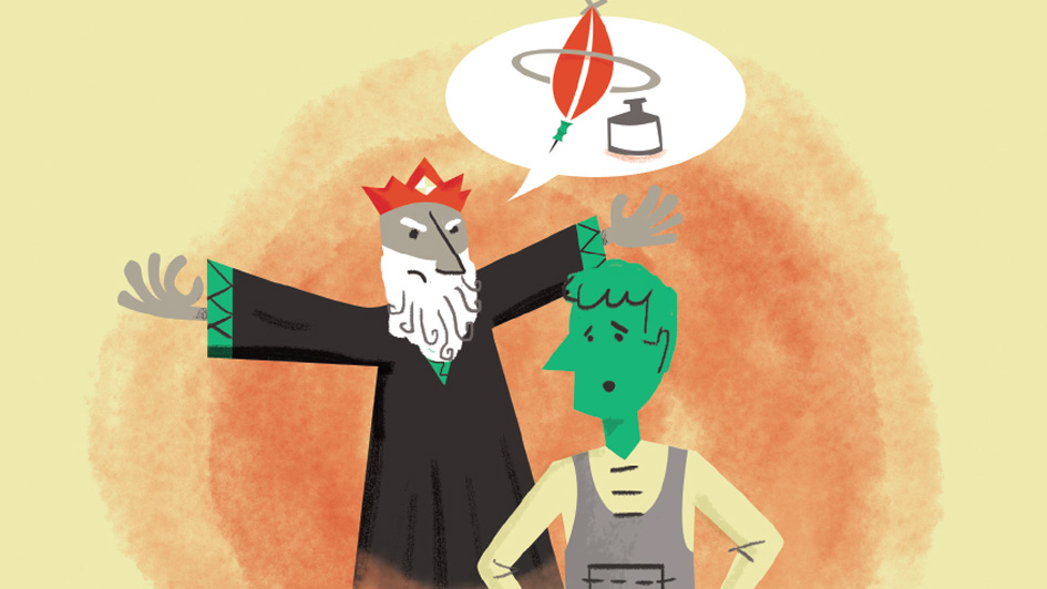
We interviewed several brand innovation firms for Branding Roundtable #12, and during that process gravitytank mentioned having created a storybook series of lessons on innovation as a gift for clients – so we challenged them to turn it into a more widely accessible resource. They responded by bringing the previously limited-edition, print-only stories to life in fun, instructive new animations. Each month this series will feature a different topic, with commentary from the creators of these fables as to the real-world inspiration for and application of each tale. This month we address a persistent enemy of the truly innovative: feature creep.
The “Creepy” Side of Innovation
Feature creep – the tendency to simply keep piling on bells and whistles to attract consumer attention and the resulting fatigue among consumers – is nothing new. Ten years ago research pointed to trouble as in When Product Features Become Too Much of a Good Thing. In the following year, the Harvard Business Review weighed in with a lengthy piece, Defeating Feature Fatigue, which noted the “… reality is that most customers don’t use anything close to the full functionality of a highly complex product. For them, more functions translate to lower value in use.”
Despite these well-established warnings, a decade later too many brands continue to fall into the trap of adding too many features. In their defense, it should be acknowledged that consumers often say they want products with more complex features, but in reality – as discussed in our interview with Rolf Wulfsberg of Siegel+Gale – they buy simpler options. Innovative options, yes, but ones that address meaningful, essential functions.
Divining the difference between a “shiny new object” and a meaningful new idea often comes down to how deeply a brand observes its users in real life. This is one of the essential lessons of this month’s fable, A Tale of Two Quills, which we discussed briefly with its creators.
Brandingmag: What was the impetus for this story?
Lucas Daniel, Strategist and Author of A Tale of Two Quills: This fable was inspired by a particular story from a favorite client – a wonderful designer and design thinker who worked for a large computer accessories company. In an increasingly noisy market, the company was struggling with how to differentiate. One of their biggest categories was computer mice, and they were getting hammered by the competition. Our client’s frustration was that his team’s response was to keep adding features to the product. While this added to the benefits they could list on the package, it certainly didn’t make for a great product or a great user experience.
Ultimately, the problem with feature creep is that design teams become focused on competitive one-upmanship. They shove more features into their product or service, thinking these additions will be sources of differentiation. Design teams then lose sight of what they are doing. They get lost trying to beat the competition at its own game rather than bring something meaningful to market.
PJ Macklin, Interaction Designer/Fable Illustrator: Behind A Tale of Two Quills is our conviction that successful innovation is driven by a firm understanding of end users’ needs and values, not a desire to dazzle with cool but meaningless features. To that point, innovation doesn’t always need to be disruptive to be successful, and sometimes the simplest of ideas can make a profound difference.
Our fable features a hero who is like many individuals we know – well intentioned but inevitably stuck inside the walls of a corporation, or a castle in this case. In the story, he is tasked with designing a quill. Our hero finds himself yielding to the demands of the king and developing a quill clearly cursed by feature creep, with components such as a stabilizer ring and grip support. Eventually, our hero saves the day by proving the value of elegant, simple, user-centered design. The king changes his tune and they all live happily ever after.
Bm: So, what should the viewer take away from this fable?
PJM: It is our hope that this generates empathy for innovators today. This type of work is extremely hard, and generating internal conviction to make the right decisions requires tenacity. We hope our story serves as a reminder to always design for an actual problem and never forget to get out of the castle!
