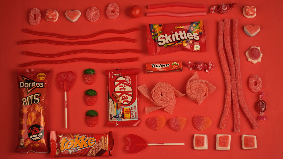
The mind works in complex ways when we encounter a new product. How would you describe great packaging design? Eye-catching. Impressive. Dramatic. But what about ‘has a positive impact on the unconscious mind’?
Despite recent increases in research pertaining to the human brain, how our grey matter functions, how it stores and retrieves memories and how it reasons, understands, and heals are all areas around which a great deal remains unknown. But we do have some insight into our minds’ frameworks and how they help us make decisions. When we take a psychological approach to packaging design, we can definitively say that for packaging design to be effective it must trigger positive emotions while working within the construct already held in the consumer’s unconscious mind. To begin with, let’s unpack the differences between processes of the conscious mind and those of the unconscious, and briefly examine how they work together.
According to the BBC, the latest research suggests that the brain is a large predictive machine, constantly comparing incoming sensory information and current experiences against stored knowledge and memories of previous experiences so that it can predict what comes next. This ensures that the brain is prepared to deal with new occurrences optimally. These two functions come together whenever a mismatch occurs (ie something happens that wasn’t predicted) at which time your brain updates its cognitive models. Gut feelings, aka our intuitions, arise when the brain has made a significant match or mismatch (between the cognitive model and current experience), but this has not yet reached our conscious awareness.
The BBC also recently reported that supermarkets employ a number of practiced tools and tricks to encourage consumers to use their unconscious minds, including smells (such as freshly baked bread) to trigger memory and the beat of the music (at low tempo) to encourage a slower, more considered shop.
So how does graphic design affect the unconscious mind? We know that as we go about our day-to-day lives our unconscious mind is constantly processing information and much of the recognition accomplished by the brain does not trigger conscious thought — but it does trigger an emotional response. We can see signs of this in the recent scaling back of logos. If logos of globally recognized brands no longer need to inform, but simply need to trigger an emotional response, why do they need text? In fact, they don’t — and this can be seen in logos like McDonald’s, Apple, Nike, Mercedes, and Shell. Textless logos succeed because the unconscious mind is already handling all the work needed for recognition of the given brand, relying on the information and feelings we already have in place, having seen and likely interacted with the brand for years.
In almost all cases, brands seek to elicit a positive emotional response from consumers when they encounter the product on-shelf. Marketers have also been known to utilize outrage (at injustice) and sadness (at another’s loss) to trigger a strong empathetic response, followed by actions such as activism and philanthropy. But for the sake of simplicity, we’ll stick to aligning brands with positive emotion since, especially in the food retail market, this tends to be the most effective route to sales.
Intuitive thinking, which colloquially is usually referred to as gut instinct, is notorious for leading us to buy impulsively and splurge on last-minute purchases; while analytical thinking after-the-fact can lead us to buyer remorse. Research has also shown that overthinking causes serious hindrance to our decision-making abilities and processes.
What’s crucial for packaging designers is finding a happy medium, which stimulates the eye and interest and supports positive feelings, while couching this within the framework that is being managed by the unconscious mind. If there’s an element of surprise or incongruence, the conscious mind, which may already be swayed, will add the information to the cognitive structure already in place, and depending on the outcome make the decision to purchase the item or leave it there.
All of this happens within just second or two.
As packaging designers, we want to elicit that bit of surprise, that incongruence, but not venture too far outside the construct to be rejected completely. Factors contributing to packaging design success include the typography, which provides a slew of signals including how traditional or forward-thinking a product is; the colour and how it relates to the product’s attributes and heritage; the shape, thickness, and quality of the carton/bottle/label; photography/illustration, which can indicate the groups of people most likely to find the product appealing, such as children; as well as any other flourishes which can lend a premium feel.
Of course, these factors are just part of the equation. In addition to all of the above, there are the elements brought by experienced and talented designers, which make the project more than the sum of its parts. One could say that designers are also using their unconscious minds, their intuition if you like, as part what guides them in their work, and that from design inception to consumer conversion we are all led to recognize and respond according to experience-based constructs which overlap — although this is all getting a tad bit Matrix-y.
The idea that our unconscious minds have such a strong bearing on the decisions we make is a compelling one, even though we don’t like to admit how much we do on ‘auto-pilot’. For packaging designers, it is an endlessly fascinating topic – one of which we all need to be conscious.
Image source: Fernanda Rodríguez
