Dear Dan Norris and Ray Shaughnessy,
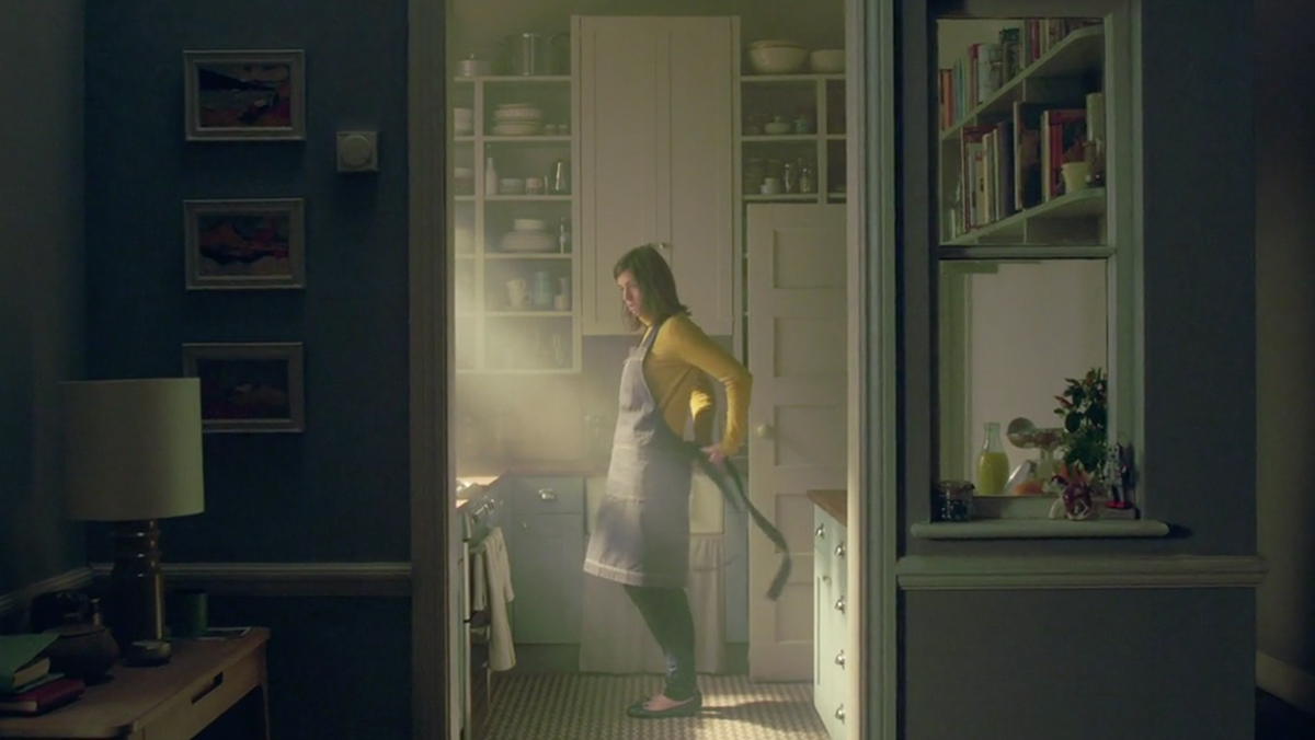
As the creators of what Lurpak has put on screen over the past nine years, both of you are behind some of the most cinematic work food advertising has ever seen. We, the food directors of the world, would (cough) like to thank you (cough) wholeheartedly (cough).
You’ve basically ruined it for us.
From the moment we hear the first pizzicato chords of Lurpak’s iconic ‘Weave your Magic‘ commercial play, we all cringe: Here we go again… You and your team have produced such a signature piece of work in food depiction that, to date, we unashamedly receive your Lurpak ads as a reference for nearly every food project, no matter how beige or boring.
I’ve heard it used as a verb – can you Lurpak it up a bit? – and as an adjective – a bit more Lurpak-y, please.
Usually, the project has neither the strategy, creative, or the budget to come close. Agencies and brands ask us to mimic the shots, the angles, the lighting, the movement, the wow. A copy of a copy of a copy is usually the result, and I plea guilty.
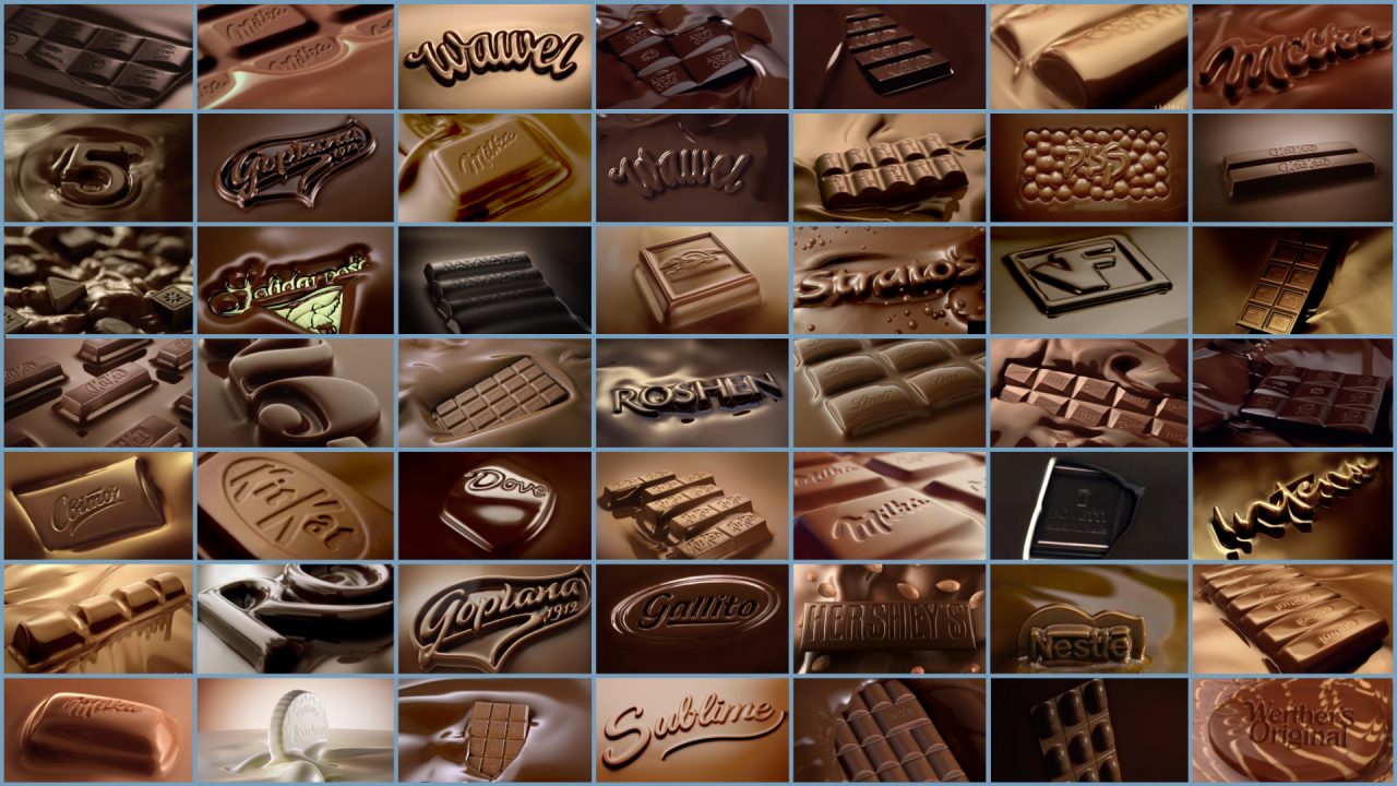
The minute something great emerges, it inspires and gets copied. This drives uniformity, which is already a challenge in food depiction. Burgers look like burgers, as do beers or chocolate. I am an avid collector of images of uniformity in food advertising. I’m the proud owner of no less than 60, nearly identical screengrabs of liquid chocolate with a chunk emerging from it, and a logo slapped on top. I’m pretty sure Avoiding Anna (25-35) and Compromising Claire (35+) couldn’t tell them apart. Add to that our clients’ commitment to category traditions: Fastfood shot in a back-of-house kitchen, swirly close-ups of beers in brown bar-like environments with a bunch of mates, and dairy brands portraying your average family in “fresh” morning light.

What is it about your series of Lurpak ads that makes them so iconic? Is it because you chose non-food powerhouse directors like Dougal Wilson and Scott Lyan to shoot them? Makers who were not infected with traditional food close-ups and slow-motion aesthetics? I bet, when you were sourcing director talent, you looked at a bunch of food directors reels and felt a bit disappointed. I try my best not to be disappointing, but I can assure you it’s not easy to find yet another angle for a flying beef patty, cheese pull, or beer pour. The fact that we have names for these shots says enough.
Allow me to let you in on a secret? We hardly get a ‘why’ in our briefings. And many food directors often are too busy playing with their new super robots and high-power LED lamps to ask for it. In the Lurpak campaign, you’ve created the perfect ‘why’. Why does the camera swoop around, why do we mimic action movies and sci-fi flicks, show explosions and infernos, and use the epic words in the voice over? Because you had a strategy.
In your own words, you wanted to ‘celebrate the magical power of the cook to transform ordinary ingredients into something extraordinary’. Those are Harry Potter-esque words. They tell a director, a set designer, or gaffer where to go: Mystical places, the abyss, Hell and back, and proudly serve the results to friends and family. With this strategy, you uplifted a boring product called butter with the most exciting images, sounds, music, words, voice, ingredients, and camera moves in the world of food advertising. It built a solid foundation for an advertising tour de force of nearly a decade, and still going strong.
In food ad-land, we get a lot of ‘delicious’ and ‘mouth-watering’ in our briefings. In my opinion, these terms are conditions, not strategies. Which makes these brands very good at solving the wrong problem. So, Ray and Dan, I read in the trade press you moved on from one award-scooping UK agency to the next. Thanks for that. It’s time you shake up another business than ours, and maybe, just maybe, the amount of Lurpak references will decline. Although, time will only tell. Thanks again.
Olaf
Cover image source: W+K London, Lurpak
