Last year, my team and I had the pleasure of working with a CBD brand to create its product range from scratch. We had never dived too deeply into the creation of physical products but we trusted our ability to create something that would stand out in one of the fastest-growing industries within health. I don’t think either of us foresaw how amazing it’d turn out, or even the reception we’d receive, but I knew the process may one day be something worth sharing so others may benefit from it.
Do your homework
When we set out to do research, we naturally turned to CBD trends first but realized that the market was still in its infancy and, therefore, any data would be unreliable at best. Instead, we chose to look at the growing natural products market as a whole. Within this market, we realized there was a demographic group called LOHAS (lifestyles of health and sustainability) that matched our values, and we decided to make them our target consumer.
Once you’ve done that, the decision-making process for each step of the way gets a little easier.
Create products focused on fixing a problem
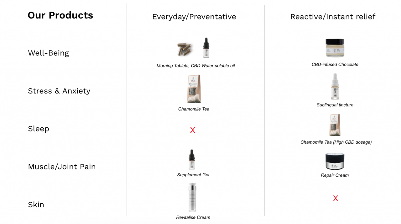
From the insights gained from our market research, we found that when it came to natural products that are used for personal health, typically (and in an oversimplified way) people consumed such products in two ways: for instant results and for long-lasting results.
Typically, the former is in high-doses and is less long-lasting, and the latter is in lower doses and used consistently, on a daily basis.
When making products stand out, the difference makes the difference
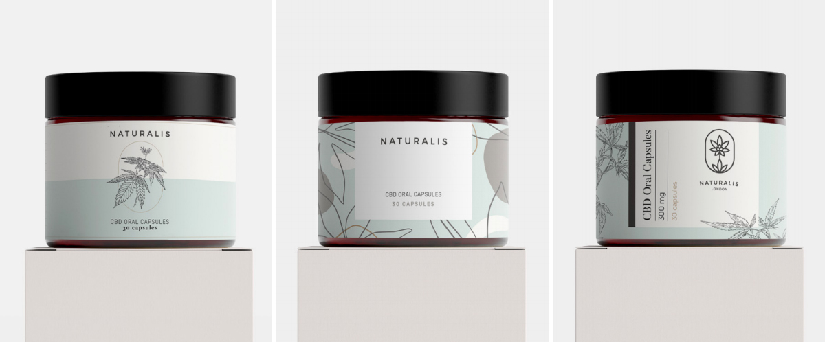
We wanted a natural yet high-end feel to the product design that avoided any cliches. The three main looks which we made a special effort to avoid were the clinical look, the vape/stoner look, and the herbal look. So that we didn’t end up with a product that looks like everything else, when doing our ideas research we actually looked in product categories far different from CBD, such as make-up, cosmetics, perfume, and even furniture brands. This may sound completely random, but it actually wasn’t (at least not entirely). Women who were our main demographic buy loads of products in those categories, so the branding ideas we found in those categories would likely work well for CBD too. In order to try out the ideas we found, we used computer-generated mockups to help us fully visualize the final product.
Our first branding attempt felt a little too clinical, clean, and cosmetic, and we just didn’t feel like it’d fit on a dress or bed-side table. We needed something with a bit more character.
Our second attempt felt like it had a bit more substance, it felt elegant but the issue was it didn’t feel homely, almost like something you’d see in a fancy department store and so it didn’t really feel accessible enough for us.
Our final attempt felt like it hit the mark. It felt homely and modest, and yet quite classy and commercial. We felt that it wouldn’t look out of place on a kitchen or bathroom cupboard, or even a bed-side table.
Use your product before anyone else does
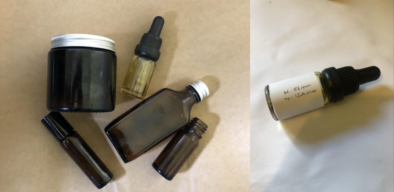
Before we went any further with the actual creation of the full packaging, we first needed to work out how they would be used. With the CBD oil, we ordered in a few different bottle samples and then trialed how they would work over the course of a few weeks on each product.
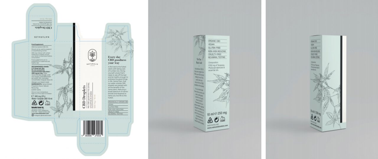
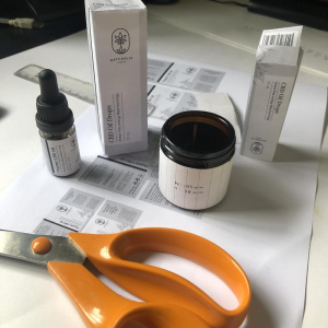
Once we decided on the bottles, we took the rough dimensions of the labels and made a few prototype boxes. It was a very “arts and crafts” approach and turned out to be brilliant to gauge things “offscreen.”
That gave us a good enough idea of the various dimensions for each product, and so we proceeded to actually design all of our mockups so they were print-ready.
You’d think, by this point, we would’ve got it all perfect? Weirdly, there were probably more changes once we’d cut everything out then there ever was at any other stage. The reason being, when it is tangibly in your hand, everything feels completely different. Writing can be too big or small, which makes your eyes pick up the wrong or even pointless information, and so you have to keep tweaking until it feels like how you first set out for it to feel.
Make sure you are noticed at the place of purchase
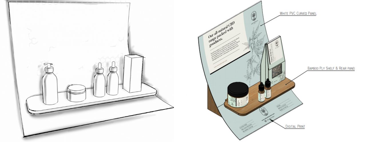
Our client wanted to grab some eyes in-store, and so it made sense for them to create a point-of-sales stand to hold all their products. As their budget was quite low, we had to come up with something which didn’t have all the bells and whistles (e.g., touch screens, lighting, sound, etc.) but was still able to draw some eyes.
We went for a minimalist, high-end design that didn’t look like your traditional stand. It’s quite unconventional in that most stands are quite rectangular and boxy. Ours, by contrast, was curved and in actual fact, very minimal because it was only actually made up of three pieces: a curved display, a shelf, and the stand.
Looks are everything
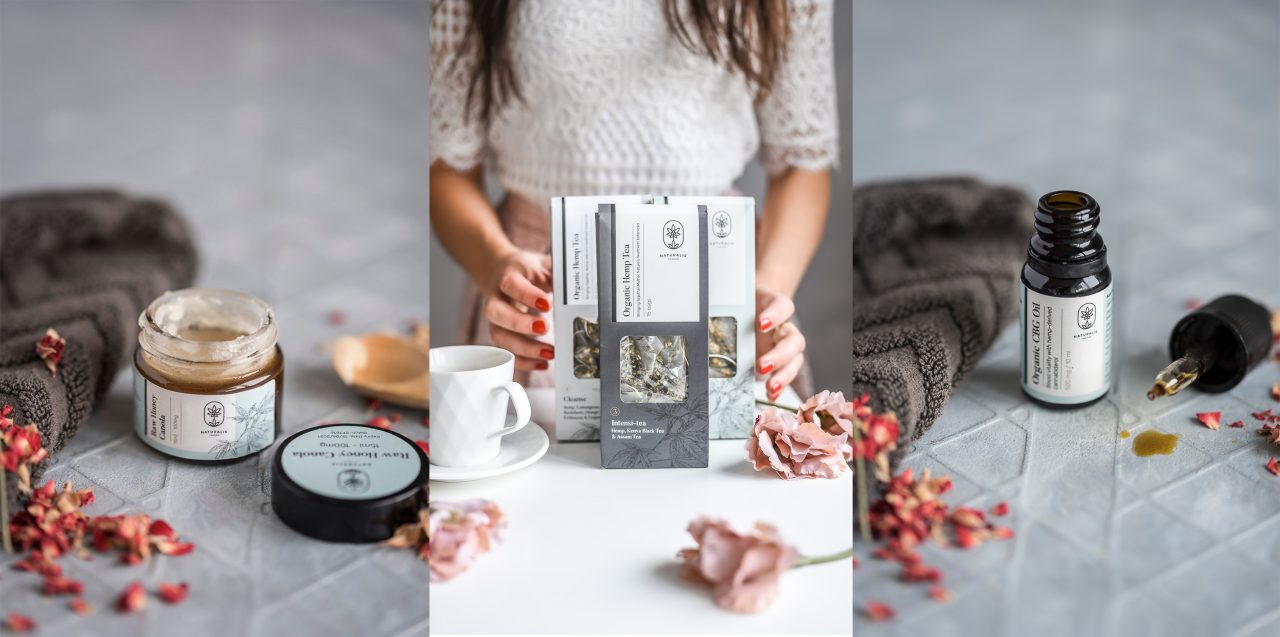
Great photography is priceless – it adds a premium to any product. Our strategy with ours was to show products in spa-like, relaxing environments, dusted with petals from flowers. Why? The products are all about giving the customer peace and well-being, and that’s what spas are renowned for.
Translate the feeling onto the website
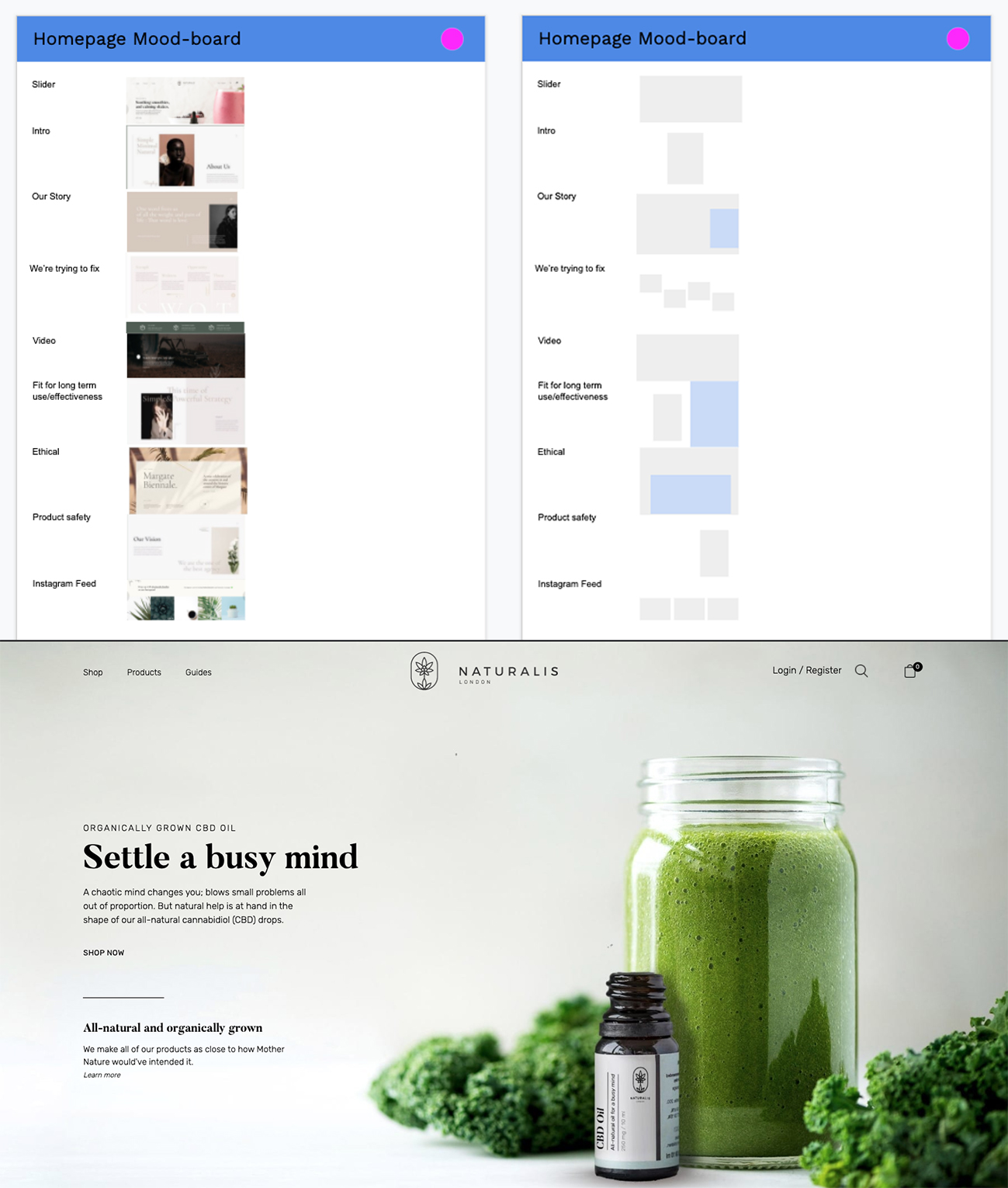
As we finished our rebrand, we updated the entire website with the new branding, which also reflected a more high-end positioning. Part of doing this also included updating the look and feel of the website, as well as optimizing it for conversions.
With our process, we intentionally worked backward in that we first sought mood-board ideas of how each section could look, and then based on how much text looked good – we then wrote that much. The reason being, we wanted the website to be design-led, doing it the other way would’ve led to compromises that were against our goal.
Once that was done, we then made a wireframe skeleton and then moved straight into designing the high-fidelity concept.
Make some noise
Lastly, we designed ads for their press campaign, with each ad designed to convey the USP in a clever or artistic manner.
For the CBD and CBG Oil, the client wanted to emphasize the purity of their product: By removing all the unnecessary bits, they created a unique product. We came up with the headline ‘So naturally healthy, we had nothing else to add’, and what we liked about it was that it was almost conversational and (hopefully) witty. It’s very short and similar to the product; to the point (pure) and without anything else (no unnecessary bits).
A couple of months later, the brand won the ‘Best CBD Product’ and was nominated for a few other products from various publications. Thinking back to what I believe was the main contributor to the success of the product, I think it was the clear idea of how the product should feel to the consumer when they’re using it. In order to achieve that, you really have to test, trial, and, most importantly, live with the product at every stage of the process and be patient when it comes to persistently seeking out that desired feeling.
Cover image source: Nikolai Chernichenko & USGS

