According to the Institute of Practitioners in Advertising, today’s advertising works less well at helping companies sell more stuff than at any time in the last 24 years.
There has been much debate and discussion about why this is, and the IPA website has lots of studies and evidence that I am not going to rehash here. Instead, I am going to open Twitter and look at the first three adverts I see. This is not scientific, it is not evidenced-based, it is simply an opinion on what I find. I might find three fantastic bits of advertising. However, I doubt it, based on what I typically see. What I am expecting to find is a very practical demonstration of lots of what is going wrong with advertising today.
Ad 1: Yoga Go
The first question that springs to mind here is about placement. I am a 40-year-old man whose declared Twitter interests are: business, marketing, and leadership. The first job of any advert is getting attention. If I scroll straight past this ad without even noticing it, then it is not effective in any way. And, it fails spectacularly on that front.
1. ‘Yoga Go’ (I do not care about yoga and I do not know what ‘yoga go’ is);
2. The copy ‘Watching your hard work pay off and…’ (I am never going to finish reading this; it’s been hard work already!);
3. The image: I do not get why the woman is pulling her top up (is she pregnant or too hot?), and the background blends it into the Twitter app like some kind of attention camouflage. It is all utterly unmemorable and irrelevant to me.
This ad, with this placement, is utterly hopeless. However, it does not have to be. For example, if you took the yellow from the logo and made it the image background, then show a man of roughly my age looking fit and healthy, with copy that talks directly to me – perhaps ‘What’s his secret? Home Yoga. It’s keeping him strong and ache free at 40 without any classes.’ This would resonate. I ache, I am aching right now sitting writing this and I would guess men in their 40s are a lot more likely to want to try yoga at home first. Suddenly, I could now be a good target for the ad.
These simple changes show just how bad the ad is, to begin with. I mean, imagine the original creative as a print ad in Men’s Health Magazine or in Wired Magazine (my mother in law subscribed me to one of these – I am not saying which one!). That mental image makes me smile because it highlights the placement and creative issues perfectly. You simply wouldn’t do it because it would cost a fortune and be a clear waste of money.
Ad 2: BirdsEyeUK
The first thing that strikes me about this advert is: Where are the chicken dippers? You could sell me some chicken dippers – in fact, I am thinking about them right now. Yum! However, how am I going to buy them having seen this advert? A big problem is that I do not know what the pack looks like. I cannot, therefore, go to the shop and see the pack and think: Yum, chicken dippers, I will buy some.
This is, in fact, how a lot of advertising works. Familiarity with something at the point of purchase increases mild preference for it over time. This results in slightly more purchases from slightly more people, driving overall brand growth. This can only work if you recognize the ‘something’ when you are ready to buy!
In addition, the ad does little for the brand. The BirdsEye logo is there but the image is an empty pan. Does BirdsEye make pans? Do they clean pans? Nope, they fill pans with food. And, yet what they show in their ad is an empty pan.
To be entirely fair, this is a video ad and if you wait 30 seconds you do see the chicken dippers. However, on Twitter, when I am not looking for cooking content the chances of me viewing the ad for 30 seconds are not high. Especially, when what I see in my feed is an empty dish – what I do is keep on scrolling.
In this case, the ad itself is not a disaster – just a disaster on Twitter. It would be fine as a 30-second TV spot or as a 15-second ad on YouTube. But it does not work well on Twitter, where people are swiping down trying to find something that is interesting to them at that moment. This highlights the complexity of digital advertising. What works on Facebook or YouTube may not work on Twitter. To get ads right on Twitter they need to be both formatted and sized for Twitter – but also designed specifically with Twitter and its specific user interface in mind.
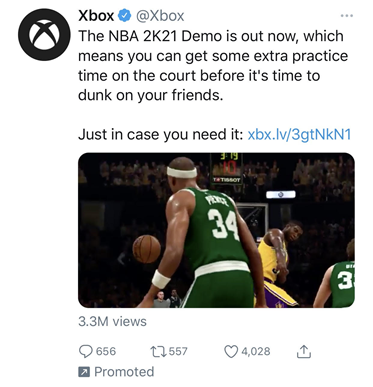
Ad 3: XBOX Game
To reiterate, I am a “very” middle-aged British man, looking at these ads from Surrey in the UK, via my Twitter feed.
Regardless of the fact that I do not have a games console (I’m sure many middle-aged men with kids probably do), I don’t watch the NBA, and as far as I know, it’s not on UK TV. Why show me a basketball game advert? I looked up the data on interest in sports in the UK and basketball is not in the top 15. More people are interested in Lawn Bowls in the UK than basketball. Xbox must have a football (that’s soccer if you are reading this in the US), rugby, or cricket game it can show me based on my geographic data?
Then there is the language: ‘2K21’. I have never heard anyone say that – maybe its youth speak. The fact that Brandingmag’s editor had to tell me it was part of the game’s title and that this naming goes back to the year 2000 says a lot about its relevance to me.
Again, there is no way this ad is going to sell me anything. And yet it could. I have two young sons; I have a niece and nephew with an Xbox. My nephew plays cricket and football so I could see him playing a game about it. It is not that hard to make this ad a lot more relevant simply based on the fact I live in the UK in a county obsessed with cricket and rugby.
What is going on with advertising?
These are just three examples, the first three adverts to appear in my Twitter feed when I opened it. However, they indicate a lot of what is wrong with advertising today. Not one of them is going to sell me anything, now or in the future. Adverts need to do three basic things to work: reach you, resonate with you, and get a reaction from you.
These ads reached me but there were two big issues with the resonance and reaction elements:
- Placement: In an age where people talk about targeting and personalization, not one of these adverts is directly, or even indirectly, relevant to me or what I use Twitter for. This is not an issue with advertising these products to me – they could all be made relevant. I need to go to the shop and buy some lunch after writing this, I could certainly benefit from doing some yoga, and I have a nephew with an Xbox who I’ll need to buy a present for soon. You could sell me all these products but not with these adverts delivered via Twitter.
- Creative: All these ads make basic creative mistakes in the context of a Twitter feed. To get a sale, adverts must either get you to buy now or later (the reaction bit). If you do not create any kind of distinctive memory structure that links the advert to what the person sees when they come to buy, they do not help you sell more stuff. An empty pan, a strange picture of a woman pulling up her top, a sport hardly played or shown on TV in the UK? Who allowed these ads to go out to me specifically via Twitter? They fail to get attention, they fail to resonate with me, and they do not create a call to action now or later.
However, I do not think we see more poor ads today because creative agencies or marketers or anyone else has got worse. I suspect all three adverts would work if placed in front of the right people in the right format. If you look at the data, the most consistently effective advertising channels are TV, Print, and Radio. There are many reasons why this could be. However, a statement of the obvious is that typically you need a big budget to advertise on these channels. Meaning a professional agency was used to make the ads and they were created specifically for the channel – nobody would use their radio advert for a TV spot! In addition, a full-time media buyer probably placed the ad next to the content most likely to be watched by the target audience.
Where digital advertising is concerned, this is all less true. Firstly, anyone can make and buy a digital ad for as little as a few pence. This is as true for the big brands as for your local furniture shop. Digital offers huge additional reach for the adverts big brands have created with their other media in mind. The BirdsEye ad is a good example. It was probably made with YouTube, Facebook, or maybe even TV in mind. Then it was adapted for Twitter to give it a bit more reach – maybe a bit more reach with middle-aged men like me. The fact that the ad does not quite work on Twitter may well go unnoticed because the additional media cost per person reached was so little, nobody cares that much.
At the other end of the scale are all the small businesses where one person does everything: Creates the ads, writes the copy, and does all the targeting on all the channels and then does all the reporting too. I suspect this is true of the Yoga Go advert. The person responsible for this ad is working with a complex media (alongside using many other channels), with almost zero creative budget, and most likely a background in only one of the skill sets needed to create great ads. It is possible that, overall, the campaign is doing OK because it is costing so little to execute it and is hitting plenty of the right people.
Finishing at the start
So why is advertising less effective than it was? I think the low cost of digital adverts is a key part of the answer. Some 24 years ago, advertising was typically much more expensive in terms of reaching national or international audiences. And, in addition, there were fewer options that were in many senses a lot simpler to understand from a media buying perspective. Today, the fact that you can reach people anywhere in the world with an advert that costs pennies to run is a key part of the problem. For big brands, there is the temptation to simply adapt an advert made with one type of media in mind for many other channels simply because the cost of that additional media is so low. For small companies, they can suddenly afford to reach millions of people while still having almost no budget for producing the advert itself. The result is worse adverts by the bucket load across every digital channel and, particularly, it appears, in my Twitter feed.
Before advertising gets more effective again, and it can, I think we need to recognize that digital channels are complex, very different from each other, and place much greater demands on the quality of the advert itself than most traditional media. For example, meaningful ‘personalization’ is an opportunity to increase the relevance of adverts to individuals. However, almost by definition, it needs a lot more work, advert variations, and time to get right. Therefore, it is only when the investment in the creation of digital adverts matches the complexity of digital media that we will start to see advertising effectiveness recover.
I guess what I am asking is that companies big and small create adverts not just formatted for Twitter, but also designed with Twitter and the way it’s used in mind from the start. That there is a variation of the advert specifically created for the major segments being targeted. And, that real thought is given to the relevance and reaction likely to be garnered by every advert shown to every one of those audience segments. That’s not too much to ask, is it?
Cover image source: Chris J. Davis


