Sagi Haviv knows a thing or two about branding. As partner at Chermayeff & Geismar & Haviv, he is responsible for some of the most recognizable visual identities ever crafted. We’re talking about visual identities so ingrained in our culture that just listing a few here will instantly call them to mind: Mobil, National Geographic, NBC, and Chase Bank.
But what’s even more impressive about these visual identities, is when they were designed:
Mobil: 1964
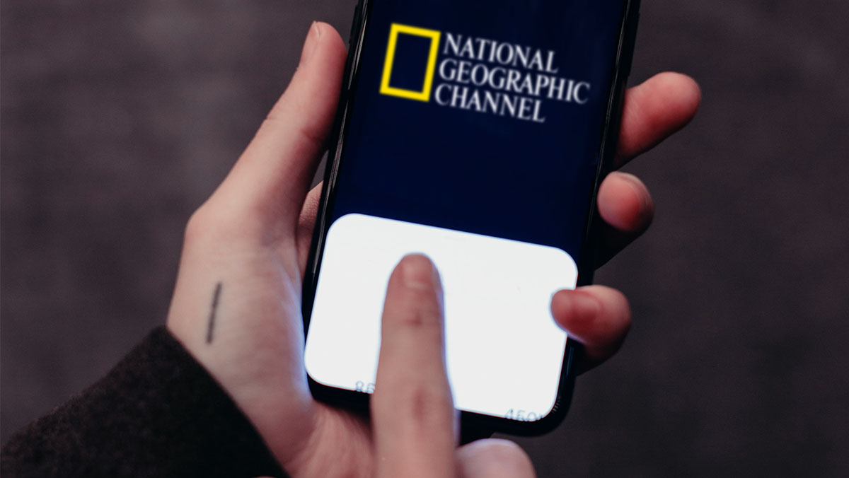
National Geographic: 1997
NBC: 1986
Chase: 1961
In the case of Chase, that logo is 60 years old. In a time when falling in love has been reduced to swiping right on your smartphone as you wait in line for your oat flat white, it’s almost unthinkable that Sagi Haviv himself says the following:
“Clients don’t have to love a brand right away.”
Excuse me?
In 2021, it may not matter that your clients love your work right away, but does it matter that their audience does?
Nothing encapsulates the power of instant love like the meteoric rise of Instagram. Launched in 2010, it only took two years for Instagram to go from 0 to 27 million users.
That’s 27 million people who engaged with an app that boiled down to one idea: double-tap to like. That number now exceeds 1 billion. Whilst the reasons for Instagrams’s success aren’t as simple as “double-tap to like”, you can be certain that functionality played a key role.
In 2012, hot off the heels of “double-tap to like”, Tinder was launched. Tinder had a similar idea, except instead of making a judgment on a photograph/video, you judge another person’s appearance with a swipe.
But neither Instagram nor Tinder would exist if it weren’t for Facebook’s pioneering work in giving people a platform to make instant judgments and then allow others to agree with them by simply tapping “like”.
One of the most famous examples of a logo that caused a huge backlash was the GAP logo change in 2010. All it took was one week for the clothing manufacturer to do an about-face and return to their old logo. Where did most of this backlash originate? Facebook and Twitter.
Instagram themselves are no strangers to this, either. In 2016, they changed their logo from the skeuomorphic polaroid camera into the more abstract gradient version we know today. Whilst they didn’t give in to public pressure, the instant hate for their new icon was overwhelming.
“My God, the new Instagram logo is a [freaking] disaster”, was one level-headed opinion I found on Twitter.
But in a world where the opinion of the masses matters more than ever before, you can forgive GAP for their change of heart, and you would’ve forgiven Instagram had they done the same.
After all, how do you choose a product on Amazon? Or accommodation on Airbnb? Or even what to order on Uber Eats? You look at the star rating and read the reviews.
We have given power to the previously voiceless and created platforms that although well-intentioned, are designed to enrage and popularise the hot-take. And when we’re giving so much value to the hot-take, we’re depriving ourselves of that lovely idiom – the idea that something can “grow on you”.
Phil Knight famously derided the Nike logo when he first saw it, but he was on a tight schedule so he just went with it. It grew on him.
In 2000, BP changed their logo from an old-fashioned crest to a modern-looking sun dubbed “Helios”. People complained then too and said it was a waste of money. But those same people moved on and forgot about it. I’d argue that, 21 years later, the new BP logo still looks fresh.
In 1998, Apple ditched the rainbow colors inside of the logo, going for a one-color solid apple. I can only imagine the backlash had social media been around in 1998.
This isn’t to say that all rebrands have been successful. Nor that the opinion of the masses is always wrong. The GAP logo ‘was’ better before. So was the Pepsi logo. So was the GM logo. So was the Burger King logo (fortunately JKR Global figured that one out!).
But it is to say that, in the pre-social media era, our tolerance for change was greater. In 1985, when Coca-Cola introduced New Coke, it took a lot of work to get Coke to listen to the hate: handwritten letters, calls to a hotline, articles in high-profile publications, and even Fidel Castro’s disapproval. If people had to go to that much effort in 2021 to decry a logo change in a high-street clothing brand or a ride-hailing app, would we hear as much outcry? Or would people simply shrug their shoulders and view logo changes with a healthy dose of perspective?
Sagi Haviv is, of course, absolutely correct; clients don’t have to love a logo right away. But they had better have thick skins because the world has changed and it expects instant love. Especially from a logo.
Cover image source: cottonbro