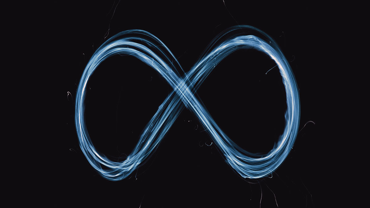
I’ve been thinking about logos since Mark Zuckerberg announced Facebook changed its name to “Meta, the next evolution of social connection.”
As I understand, the metaverse is a hypothesized iteration of the internet, supporting 3D virtual environments. No vaccination passport required, but you will need a virtual reality headset.
Some branding and design experts suggested the change was an attempt to deflect news of recent scandals. According to my graphic designer son, it was logo design 101. Blue is historically associated with safety and trustworthiness (ha!). Logos without corners are nonthreatening. It can easily be applied across media platforms. Class dismissed.
Facebook said they “needed to future-proof the symbol” but my son thought it was “evocative of the past”, noting infinity symbols are nothing new. And, while I’m sure someone could rationalize why this logo screams “metaverse”, I can’t think why. Although Facebook, aka Meta, doesn’t have to rely on any logo given their place in the brand firmament – but with a gazillion dollars to spend on marketing when they so choose, why make a logo so redundant? And why not engage an independent design firm to assist?
Unquestionably, logos are part art form, part fabric of consciousness, part popular culture. And, according to experts, more and more part of a brand experience. And, although art lovers we may all be, value in the form of recognition alone really isn’t enough to drive you to redesign your logo. How much does the fact we recognize a logo change our behavior toward the brand and the experience it is supposed to represent? That’s what you want to know because logos are visual touchpoints.
Everyone has an opinion when it comes to logos. Like flags to nations, logos give people something in common to identify with. Or should. Something to rally around. Or should. Something the brand can use to put a stake in the marketplace. Or should.
Things get blurry when companies mistake logo development or redesign for actions that will significantly contribute to customer engagement, brand loyalty, and profitability. One of our clients commented on the high price of having their corporate logo “revitalized and iconized.” That was how the strategic-corporate-brand-identity-design-branding firm described the exercise. He said, “I don’t know what we got for our money. Everybody knows our brand. So, what was the ROI for ‘revitalizing’ it? The ‘iconization’ added 20% to the development costs!” It was a reasonable question. And just an OK-looking logo.
To be clear, I am no Philistine. I appreciate great design and the creative challenges involved in capturing a brand’s essence through an icon. My inner art director is alive and well. I like to talk about logos too. Loyalty and profitability, however, prove a steelier basis for understanding ROI when it comes to logo development.
OK, sometimes corporations are in crisis. They think a brand logo overhaul will help or, at least, detract from bad press. Sometimes it’s a corporate mid-life crisis. Or just a new ad agency. In those cases, there are usually no substantive changes attributed to the exercise beyond the PR value in an announcement the company has a new logo. Papa Johns just did that.
In a company PR release, they said, “Papa Johns new logo is a visual reflection of the new tone being set by the brand – bold, simple, fun, and clean,” which is what a PR person would say. (If this reflects the “new tone set by the brand”, was the old one timid, difficult, boring, and unclean? Just asking.) More importantly, would a consumer say that? I’m pretty sure you wouldn’t. And I didn’t make a punctuation error. They dropped the apostrophe. Precisely like Bojangles did 15 months ago. I wonder if Papa Johns used the same strategic-corporate-brand-identity-design-branding firm or if losing an apostrophe is the new trend in logo re-design.
And yeah, sometimes “new” is better. But sometimes “new” is just “new”. And if the change doesn’t contribute to increased customer engagement, positive behavior, and profits, why do it? Heavy-duty rationalizations for change will always be there, but there are ways to measure how much a new logo will contribute to engagement and loyalty. The thing is, like many, many marketing and branding exercises, consumer responses to logos are emotional. Ten-point scales or counting tweets don’t cut it.
As part of our annual Customer Loyalty Engagement Index, we also measure whether brand logos are leaders or losers. This year the top-3 logos contributing to brand engagement were:
- Apple
- Nike
- Polo
Whether you call it a logo, symbol, icon, avatar, or gateway to the metaverse, no matter if it’s a piece of fruit on your desk, a swoosh on your feet, or a polo player on your chest, a company’s logo can materially influence perceptions of a brand, which is important if you’re not Facebook and don’t have a gazillion dollars in your marketing budget. More importantly, it’s something that can be measured – beyond recognition and awareness – to see whether your brand is something customers are actually willing to pay to be a part of.
Cover image source: Sandip Kalal
